Unveiling 2024 Food Photography Trends: Your Comprehensive Guide
Welcome, friends and creatives, to the SHP Blog! And this one is a meaty one, so grab a cup of tea. As we stand on the cusp of 2024 (can you believe it!), it’s that time again to delve into what, in my humble opinion, will be the food photography trends of the coming year. But remember, while it’s important to explore these shifts and be aware of them, it's about seasoning these trends with your unique flavour - you don’t have to let them overwhelm your own style. So, let’s unwrap what 2024 has in store for us!
Trends Don’t Just Happen: Understanding the Triggers
These trends aren’t born in a vacuum. They’re reflections, responses to the wider world . From economic shifts to interior design adaptations and what’s happening on the catwalks of high fashion, all of this ripples down into our niche of food photography. They way it usually flows is this:
Current Global Landscape ➡️ Socio-Economic Challenges ➡️ Fashion +Art ➡️ Interior Design ➡️ Homewares ➡️ Food Photography
This is a very simplistic explanation, but it gives you an idea. It’s handy to know HOW these things come about because then it enables you to forecast, and thus keep your commercial work relevant and perhaps even get ahead of the curve a bit.
We, as humans, have been living through very turbulent and unstable times (cue the pandemic, cost of living crises, global conflict, etc). Our collective experiences: the search for the grounding amidst uncertainties, the want of calm, authenticity and connection – a desire for comfort and the familiar, have led us here - looking for home and a shelter. Seeking warmth, organic materials, and softer lighting.
The Shift in Palette: Goodbye Cool Tones, Hello Warmth
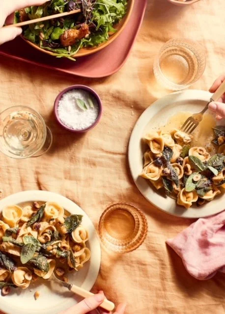
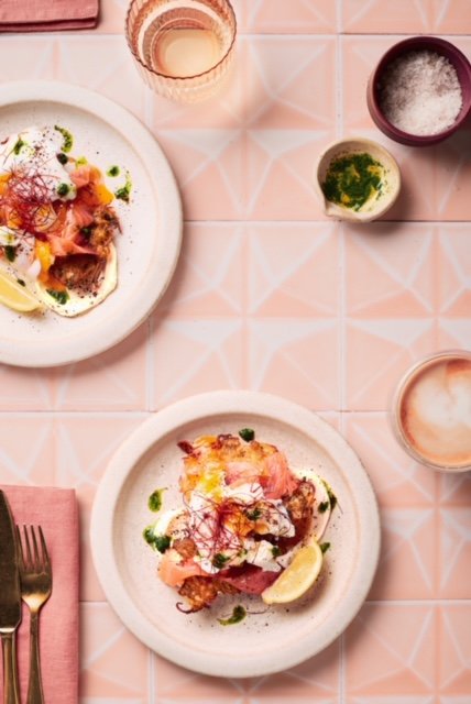
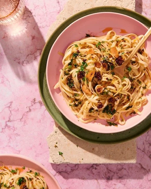
After a long while of cooler tones/temperatures/etc, these are beginning to take a back seat. You have probably noticed this already. The coming year marks a cherished return to warmth, a soothing balm for the chaos we've all weathered. Imagine hues that hold you a bit more gently: amber, ruddy browns, mellow yellows, and the soft romance of clay pink. Olive greens, mauves, terracotta, and apricot help lay the foundation of comfort, with spirited pops of accent blues and reds making a splash too.
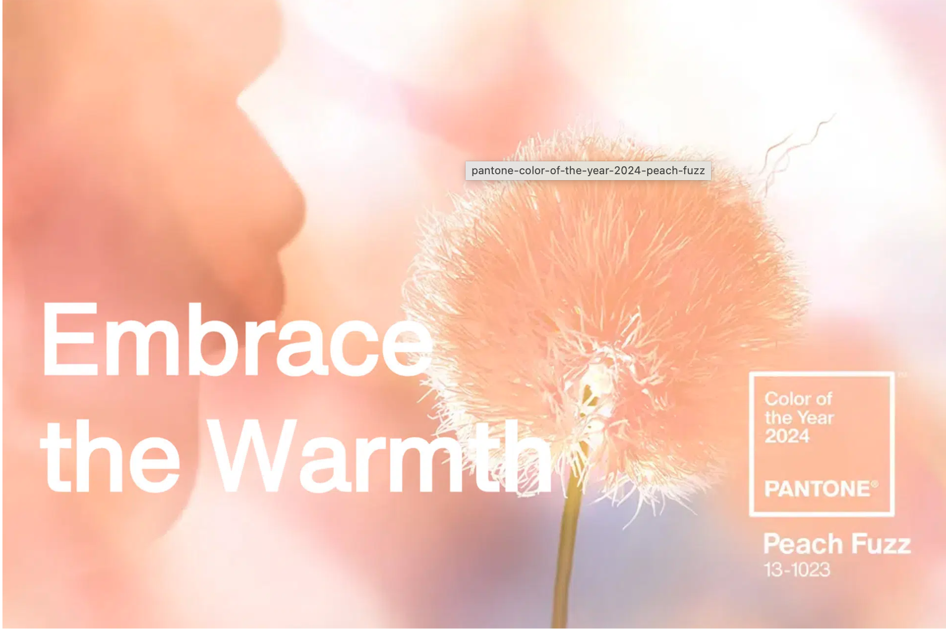
Particularly noteworthy is what is speculated to be Pantones Colour Of The Year for 2024: Peach Fuzz. A hue that is warm, cosy, and “is a fresh approach to a new softness. Subtly sensual, PANTONE 13-1023 Peach Fuzz is a heartfelt peach hue bringing a feeling of tenderness and communicating a message of caring and sharing, community and collaboration”. These aren’t just colours; they’re messages, emotions, vibes. The psychology of colour is a very real area, and the words that the hues of 2024 bring up are:
honesty, balance, grounding (shades of brown and taupe)
humility, wistfulness, nostalgia, intimacy (your mauves and clay pinks)
natural, restorative, subdued (olive greens and khakis)
hope, enrichment, comfort (yellows)
uplifting, warmth, ‘hearth + home’ (shades of russet, terracotta, amber)
Do you see how integral colour is to all things?
How it’s a part of everything?
Patterns with Personality: Beyond the Colours
Keep an eye out for some statement patterns. The hot-tip from the design industry is that stripes and checkerboards are about to enter the room, especially on floors in terms of interior trends, helping to bring a bit of dynamism without all the chaos. Could you perhaps incorporate these with the use of backdrops? What props could you possibly find these patterns on? Napkins and linens in gingham maybe? Have a think and a play around. These don’t have to dominate your scene (although you could certainly try to make a statement with them), but could poke their heads in in subtle ways.
Small accent pops of bright red and vivid blue are also playing around in the background, and these could help to add a ‘lift’ to your scenes.
Also, anticipate 'colour drenching' - an intriguing play on the monochromatic colour palette. It uses a play of light and shadow in the same hue, creating dimensions with tones rather than with contrasting colours. It’s about unity, cohesion, harmony.
Natural, Organic, Harmonious: A New Era
2024 is very much shaping up to be all about textures. Again – you’ve probably seen it trickle through already. Natural materials and finishes will dominate, bringing sustainability and organic harmony to the fore. So think stone, marble, clay, linen. Natural fibres and surfaces with muted colour tones. Easy enough to incorporate through your chosen backdrops.
I love the Japanese notion of ‘Wabi-Sabi’ - the art of finding beauty in imperfection, with organic shapes and intentional asymmetry.
And guess what’s making a sneak entry in the background? A retro mash-up, swinging between the '60s through to the '80s, with chrome and metallic details popping up occasionally.
Composition + Lighting Trends: Less Is More In 2024
As much as I love a good ‘hard light’ image, my personal feeling is that these have been a bit done to death as far as being ‘trendy’ goes. Hard light will still be around but I think we’ll start to see more “filled’ hard-light. I also believe that soft light will be making a huge come back. Think about everything we’ve discussed so far: soft light echoes that mood that we’re all after at the moment. It’s calming, certainly more peaceful, and harmonious.
Compositions will start to echo our desire for simplicity – less is more. Think clean lines (whether straight or curved) and negative space. A space of calm and clarity. Sounds incredibly nice right about now huh?
Personalizing the Trends: Stay True In Adaptation
As we step into 2024, remember, these trends are your tools, not your masters. They're the spices you can use to flavour your work, not dictate it. Your style, your story, shouldn’t get lost in the noise of what’s 'in’ and ‘on trend’. I want you to still trust your personal style and aesthetic, whilst being aware of how embracing some of these trends can serve you in your client work. View these 2024 Food Photography trends as springboards rather than constraints or ‘have to-do’s”.
Your Turn: Dive into the Dialogue
So, tell me, how do you plan to dance with these trends while keeping the core of your style untouched?
I’d love it if you could share your thoughts, fears, excitement, ideas, etc with me and the wider food photography community.
Let’s walk into 2024, armed with insight and brimming with creativity, together.
Ready for this journey?
Comment with your insights. For those hungry for more, keep an eye out for further blog posts, and if you would like any help with the challenges facing you in 2024, book a 1:1 Food Photography Coaching session with me and we can get you on your way. Here’s to a year of authentic creativity and shared growth!
Yours Creatively,
Sally x
